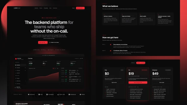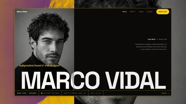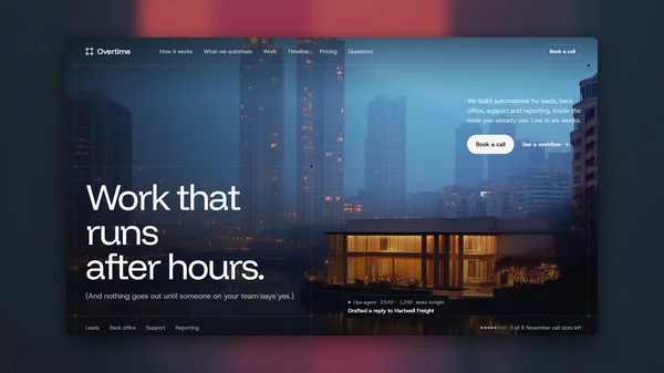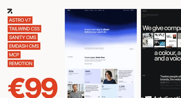


Studio Nord is an editorial design-studio template built on Astro 7 and Tailwind CSS v4. It ships with every page wired up, every content collection structured, and every SEO detail in place, so you can focus on presenting your studio's work and point of view instead of scaffolding your site.
Studio Nord stays fast by default: no heavy animation libraries and no client-side framework taking over. Alpine.js handles the few interactive pieces and Lenis smooths wheel and trackpad scrolling. What you get is a quiet editorial aesthetic and a codebase that stays out of your way.
Who is this template for?
Design studios and small creative practices that want a complete editorial site (work, studio, journal, services with pricing, contact) without months of design and engineering.
Freelance designers and independent art directors who want a considered portfolio that presents case studies, writing, and services with credibility rather than noise.
Agencies and developers building studio sites for clients, who need a type-safe, token-driven starting point that survives a hand-off.
Features
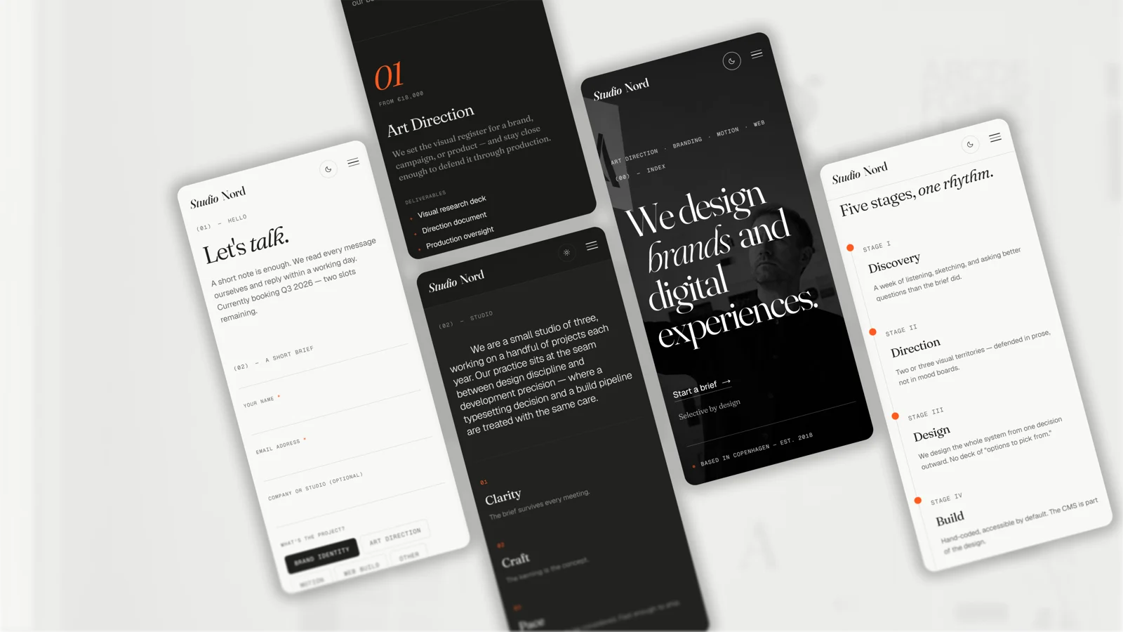
- Light + dark theme: A deliberate dark companion palette, applied before first paint with no flash and carried through View Transitions.
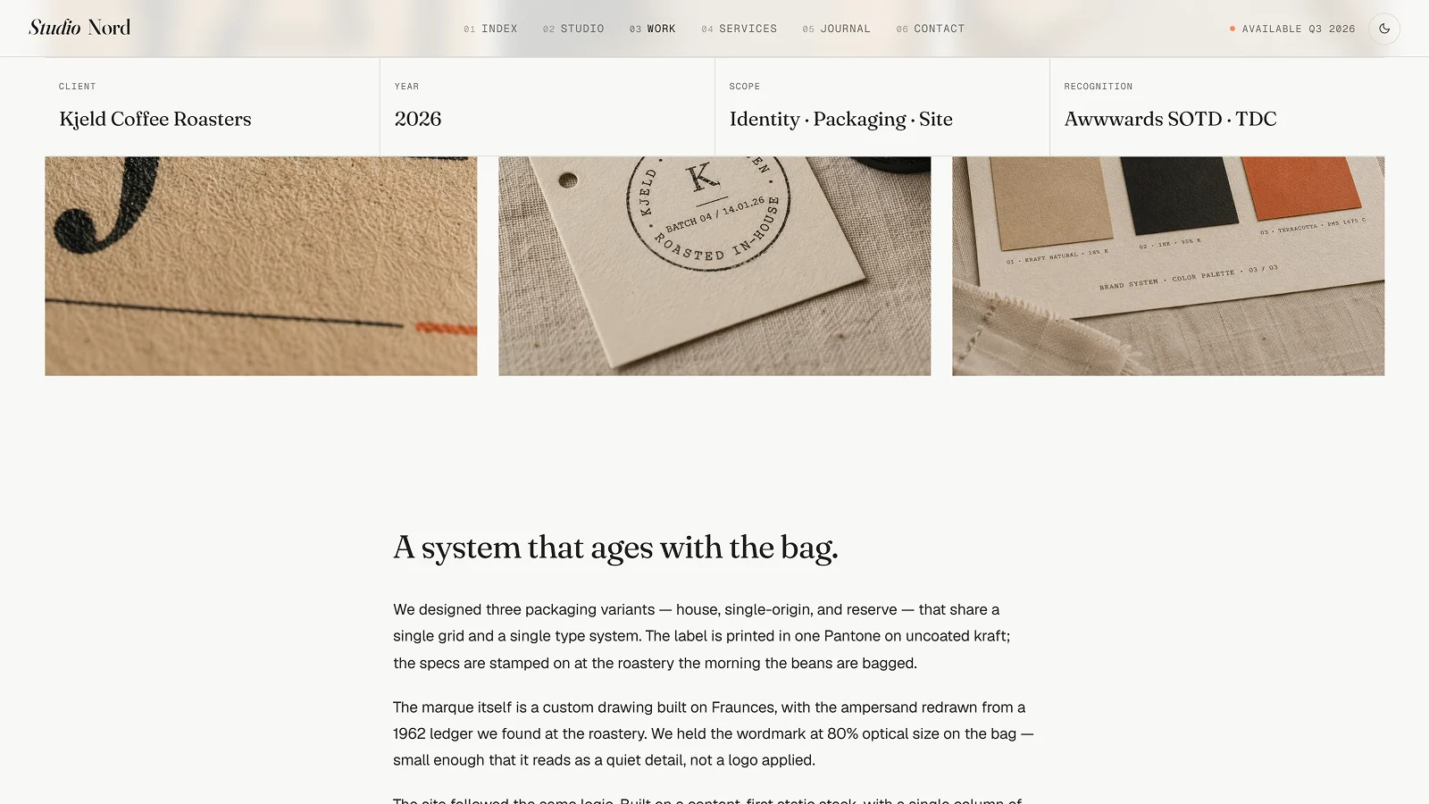
- MDX Work collection: Twelve case studies with typed frontmatter, four complete write-ups and eight in-production entries that render a ready-made stub page. Sticky info bar, credits, and next-project link.
- MDX Journal collection: Six entries, three full essays, with a featured entry, search, tag filters, author cards, and related entries.
- Prose pages: Drop a Markdown file into src/content/pages/ and it becomes a page. Privacy, Terms, Accessibility, and Colophon ship written.
- Lenis smooth scrolling: Smooth wheel and trackpad scrolling that pauses with the mobile menu, survives View Transitions, and switches off for reduced motion.
- Self-hosted type: Fraunces with its full optical-size axis, Geist, and Geist Mono, self-hosted through Astro's Fonts API with metric-matched fallbacks.
- Token-driven design system: Colors, type, spacing, and motion live in @theme tokens in one file, light and dark in lockstep.
- SEO complete: Meta descriptions, canonical URLs, Open Graph, Twitter Cards, JSON-LD, and sitemap from a single layout.
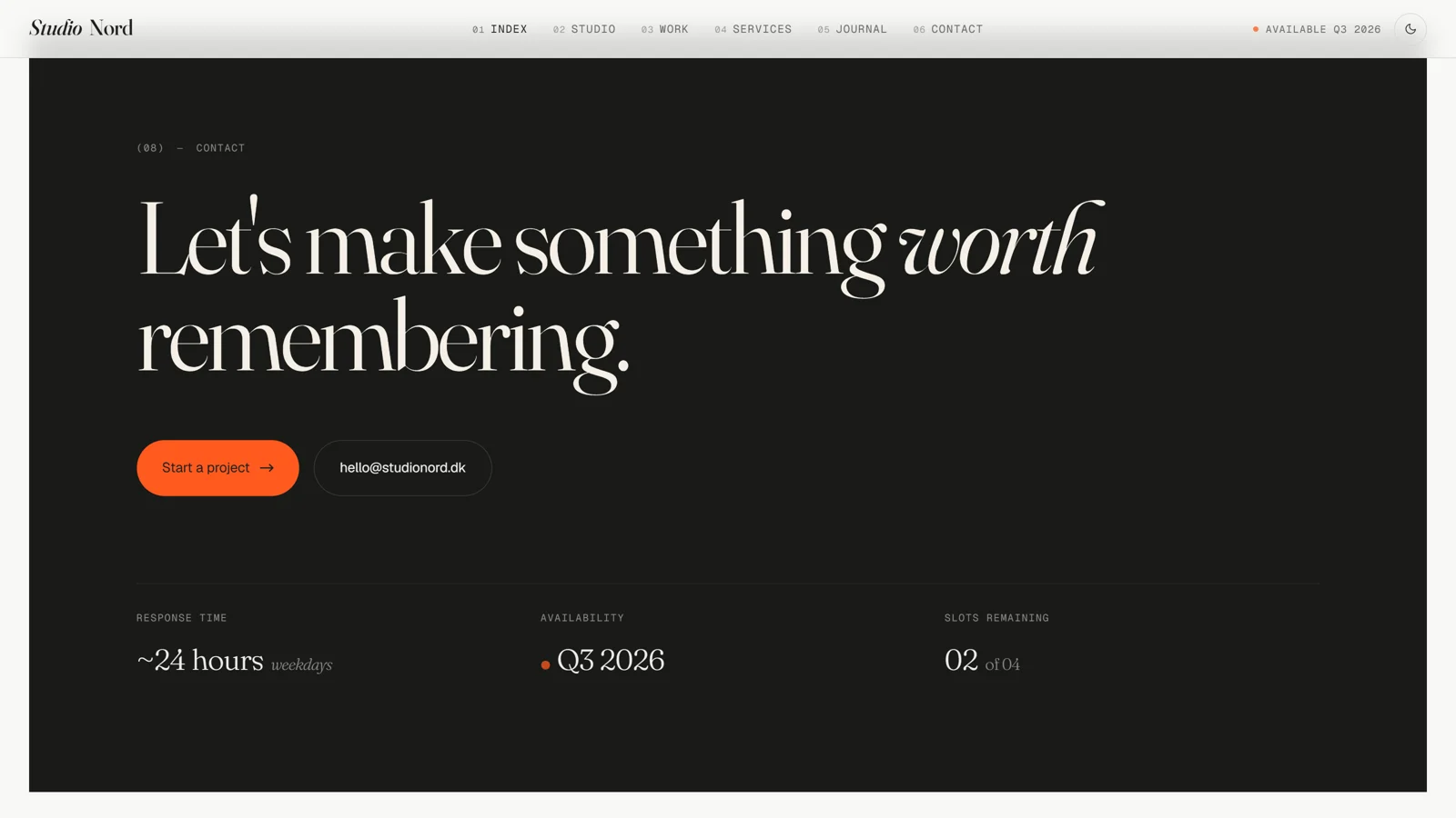
- Editorial details: Asymmetric featured-work spread, drop cap, marginalia notes, facts columns, fig captions, and a dark inversion contact CTA.
Tech Stack
- Astro 7
- Tailwind CSS v4
- Alpine.js 3
- Lenis
- TypeScript (strict)
- MDX
- astro:assets
- Astro Fonts API
- @astrojs/sitemap.
Pages & Sections
- Home: hero, featured-work spread, studio statement, services preview, clients marquee, awards, journal, testimonials, contact CTA.
- Studio: philosophy with drop cap and marginalia, team, press, availability.
- Work: filterable archive and case-study detail pages.
- Services: four service blocks, five-step process, three pricing tiers, FAQ.
- Journal: featured entry, search, tag filters, and article pages.
- Contact: form with project type and budget, plus a studio info aside.
- Also: Privacy, Terms, Accessibility, Colophon, 404, and a style guide.
Performance & Accessibility
Audited with Lighthouse on the production build in both themes: 100 for accessibility, best practices, and SEO on every indexable page, with mobile LCP under 2.5 s on a throttled trace. WCAG AA contrast in light and dark, keyboard navigable, and reduced motion honored throughout. Static output that deploys anywhere.